
Today’s Topic
“Hi. I’m your expert instructor here to teach you how to be an expert almost as good as me. Next slide.”

“So you can see here all that we are going to cover over our period of training. I’m sure you will notice that I have done all I reasonably can to remove any fun we might have learning this material because I did it all on my slide deck. Next slide.”
LEARNING GOALS
“I made sure to include some learning goals because everyone expects them, but we really are not going to talk about anything like this; don’t worry, it is all in the slide deck because I am such an expert on this topic. Next slide.”

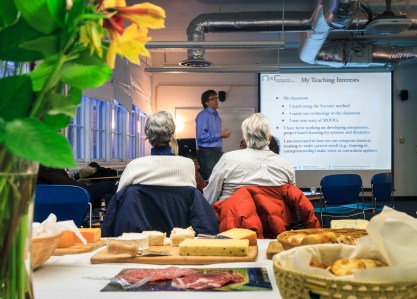
Anyone still awake, or have you all succumb to the slide deck of death? To often, out-of-town experts are hired to train people whose only real expertise lies in preparing really cool slide decks. There is more to training however than a wiz-bang slide show, especially if the topic is mostly information known to the students. Slides have become the go-to choice for training because they provide consistency across a variety of training presentations regardless of the ability of the instructor or the knowledge of the students. There are other forms of media available for instructors to communicate ideas and guide discussions. Learning to use them well improves your presentation.

These two forms of media are often overlooked for a variety of reasons including poor penmanship, artistic ability of the trainer, and lack of standardization over multiple presentations. The biggest reason is a lack of imagination. Several years ago I learned a little trick to improve my drawing ability in Richard Neil’s book, Police Instructor. Neil suggests creating an image in your favorite graphics program them projecting it onto your paper. Using a #2 pencil, lightly trace the lines. When you reach the point in your presentation to introduce the sketch, grab your marker and draw away while you talk to your students. You end up with the same image from class to class and impress your students with both your knowledge and artistic ability.
I used this secret in an instructor development class I was teaching to explain the training cycle. I asked one of the students to step up to the easel and sketch out a diagram of the cycle while I talked about it. He was a bit apprehensive until he was close enough to the board to see the lines. The class was equally impressed with mine and the student’s knowledge of the cycle, and the secret, once it was revealed. Two lessons in one, how to improve your use of media and improve your understanding of the training cycle, a grand slam!
It may not be possible to recreate a fancy drawing or diagram on a white board in the same way, but for basic imagery it is a great tool. Create lists revealing one point at a time so students are not overwhelmed with information. Alternate colors so students can track lines easier. Practice so your writing is recognizable to others. Simple diagrams that are well thought out ahead of time are easy to draw on a white board with lines and arrows to make connections with thoughts that are expressed in text. Try it out in your next class; you might be surprised how it catches your students attention.
POSTERS
Posters seem like they have gone the way of the dodo bird. They are a great tool to ensure continuity from class to class. They work even when the projector bulb doesn’t. Use dry erase markers to high light important words or ideas on laminated posters. This technique helps make connections between ideas.
You can create posters using a professional service, or in your living room using markers. Boil down your ideas down to the most essential elements to reduce the number of them. Too many posters end up being nothing more than a low tech slide deck that you have to lug around. The more you have, the heavier they are!

Too many people use boxed PEs they like from other classes. Using the general format and adapting it to meet your needs however allows you to end up with a product unique to your class that is designed specifically to meet your training objectives. Good practical exercises are copied by instructors because designing them is tough work. The first time you have a student build a pasta tower to the ceiling and perches his or her marshmallow at the top, you realize it is better to use your own ideas to reinforce your learning points.
Good exercises challenge students to apply the lessons you teach. They make students think critically about using new skills in familiar situations. They provide students the confidence to adapt your lessons in their every day life, changing their habits and behaviors, and that’s what training is supposed to be about, changing behaviors.
VIDEO CLIPS
Video Clips are great to introduce problems, demonstrate your point, show how to complete an activity, or as part of a practical exercise. Too often trainers use videos as the basis for their entire training, instead of supporting their training and learning points. There are plenty of good videos available on any of the video host web sites. If you are using video for an educational purpose then it should spur discussions and questions about topics related to your learning goals. If not, then it is entertainment and you may have problems with copyright laws. If your video does all the teaching, then students are unlikely to see you as the expert you profess to be.

Next slide please. Slide decks have become an important part of the training landscape. Slide decks are not going away soon. Trainers communicate better using other forms of media instead of only using slides. Other forms of media require trainers to think about the points they want students to learn. Each media offers opportunities to engage students, keeping their attention to improve learning outcomes. Posters, chart paper, white boards, practical exercises, and video clips each offer instructors opportunities to break away from the slide deck and improve learning. Each form of media has pros and cons. Use a variety of media in your training to break up the boredom of the slide deck and show your students you really are an expert.
– – – – – – – – – – – –
Photo Credits
Author except the marshmallow tower. Marshmallow tower by Mark Tighe under Creative Commons Attribution license from flickr.com: https://www.flickr.com/photos/mjtmail/14113827338/in/photolist-o2yZKQ-8W4FUQ-8W1CxZ-nvc49E-9NDbrG-9NDcWb-9NDdLs-9NApRH-9NAur2-9NAmLB-9NAnBt-jeQaVE-9NAtKa-9NAsga-9NAsXc-9NDhzm-9NAorP-Hsu3i-bDzKGQ-dc4jeH-8xac39-BMSG49-BXt5Le-8Ur9Rp-rV2Uwa/
 Any popular instruction beyond the basics of how to create slide decks emphasize the importance of graphics. Presenters face challenges finding inexpensive images to really make their learning or persuasion points powerfully. Learning about and finding public domain and Creative Common licensed images liberate presenters from corny clip art and open a world of high quality pictures, clip art, and video free from fees and royalties.
 Flickr is the big name, but not the only source for free images. Google Images provides access to lots of images. Like flickr, not all are free, but like flickr, you can filter your search result to show just public domain or Creative Commons images.
 Pxhere.org images are all Creative Commons licensed with no use restrictions. That means anyone can use or remix any image for any legal purpose according to the website.
  Clip art is more difficult to find, but a good source is openclipart.org. All images are open source. Users should familiarize themselves with the restrictions of each type of license before using images from any source.


